 Marginly.
Typography is a way of being polite
Good type does not ask to be noticed. It makes a long page feel like a short walk.






Good type does not ask to be noticed. It makes a long page feel like a short walk.
Outline
Open any printed novel that has survived a few decades and you will find a layout that nobody remembers. The margins breathe, the lines are neither too long nor too short, and the page turns itself. This is not an accident. It is courtesy, rendered in millimetres.
The rules are old and few. Keep lines to roughly sixty-five characters. Let the leading be a little more generous than the size. Use one typeface for the long read and a second for the signposts. Break all three and the reader will feel tired without knowing why.
Websites inherited the vocabulary of print but not its discipline. Text stretches across forty centimetres of monitor, buttons shout in four fonts, and the reader's eye is asked to do the work the designer skipped. The result is that most people skim, and then blame their attention.
A well-set page is a kind of hospitality. It tells the reader there is time, and that someone prepared the room. That is worth more than any amount of animation.
Topics
Designer turned writer. Covers product design, typography and why old things feel better.
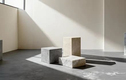
The most comfortable seat in the house is rarely the one a designer would choose.
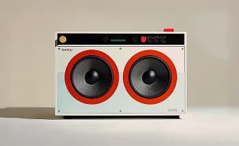
On the quiet disappearance of things you could press, and what replaced them.

A year in a rented kitchen with one pan, one knife and no scale.

0 comments
Loading…
Join the conversation
Please sign in or create a free account to comment.